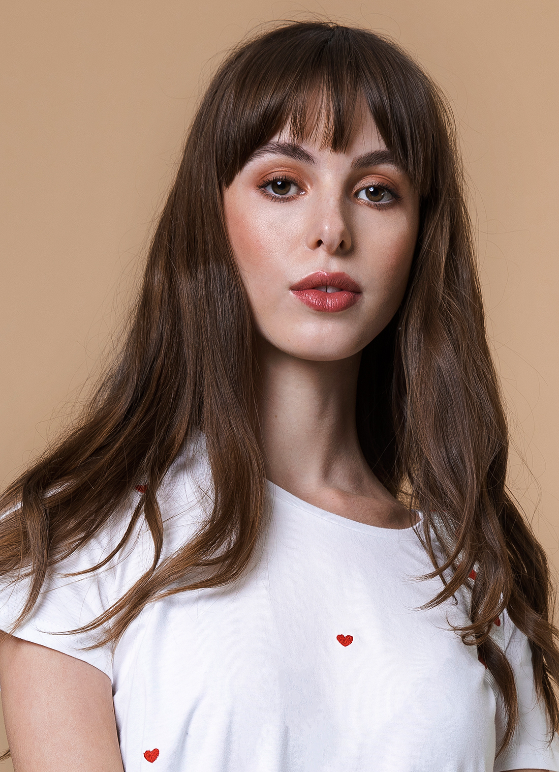
Sugar + Style studio e-commerce shoot

If you followed me for a long time you probably know that I always shoot in natural light. I don’t really like studios and I don’t really shoot with studio lights much. I also don’t usually share e-com as it’s a boring most of the time. However I quite like the set design, styling and model for this studio e-commerce fashion shoot for Sugar + Style. Most of the time when I see a studio photo, I want to know what sort of lighting the photographer used and how. So that’s another reason I’m sharing this post. If like me you’re not very experienced with studio lights, I thought it might be interesting to know.
Studio lighting
Each time I shoot in a studio, I do the lighting as simply and effectively as possible, as e-com shoots are not really the time to experiment. I use a main light, usually a softbox/octobox quite high up in front of the model, light hitting the model downwards at an angle. And depending on how light I want the background, I add some lights to light it up a bit. And that’s what I did on this shoot. I used a huge octobox as a main light which I loved, and some lights at the back to light up the set design and the background. I loved the warm colors from the props and our chosen background, that’s why it didn’t seem as boring to me as the usual white or very light background.
Let me know what you think of this type of post and which look is your favorite. Or ask me if you have any questions and give me a tip (as I said I’m still very much learning myself). My other commercial shoots can be seen here.
photography: Ailera Stone
Set Design and Styling: Jubbi
Make up and hair: Andra Petrea
Model: Olivia Williams


I took a few simple portraits at the end as well:

follow me on instagram @ailera


These are gorgeous! <3
Aww thank you Kailey, wasn’t sure if anyone wants to see this type of stuff. :}}